You've Reached the Center of the Internet
It's a blog
Batting Order (Kind of) Doesn't Matter*
I live in Greater Boston, but I’ve been a Yankees fan my whole life. The season is getting started and I have a new baby, so I’ve been listening to every episode of my favorite baseball podcast, Talkin’ Yanks. Hosts Jomboy and Jake spend a lot of time discussing, critiquing, and guessing Yankees batting orders. It’s a fun topic, but my intuition is that the batting order isn’t that important. This post is my attempt at estimating how important batting order is.
Jomboy predicts the Yankees Opening Day starting lineup pic.twitter.com/PeeX2YKzjT
— Talkin' Yanks (@TalkinYanks) March 18, 2025
The method
I used a Monte Carlo approach to generate distributions of runs scored given different batting orders. This is a fancy way of saying that I simulated a lot of baseball games with different lineups, and used the outcomes of those simluations as distributions of expected run production. By comparing these distributions across different batting orders, I could evaluate which lineups are more effective.
To implement the simulation, I modeled the game in the simplest way I could. As you’ll see, I think it does a decent job of capturing reality. I defined hitters as a set of static per-plate-appearance probabilities. The plate appearance outcomes I modeled are walk, single, double, triple, and home run. So each hitter is completely defined by their \(P_{BB}\), \(P_{1B}\), \(P_{2B}\), \(P_{3B}\), and \(P_{HR}\).
To simulate a game, I step through the lineup and randomly select an outcome weighted by the current batter’s probabilities. I track outs and runs scored and which bases are occupied. When three outs are recorded, I clear the bases and start the next inning. To simulate a game, I run this algorithm for 9 innings and track what happens.
I use simple logic to advance baserunners and score runs.
- Walks advance runners only when forced
- Singles put the batter on first and score runners from second and third
- Runners advance from first to third with 30% probability, else they go to second base
- Doubles clear the bases and put the batter on second
- Triples clear the bases and put the batter on third
- Home runs clear the bases and score the batter
- Outs advance runners from second to third and score runners from third with 10% probability
By running hundreds of thousands of such simulations I can estimate distributions of team outcomes.
There’s a lot here that’s not modeled. The pitcher is of course an important factor, but my model essentially always assumes an average pitcher is on the mound. Similarly, factors like the defense, runners, lefty/righty splits, extra innings, and emotion, are not modeled.
With that caveat, here is the simulated distribution of the runs scored in each game by the 2024 Yankees. I’ll focus on the Ya
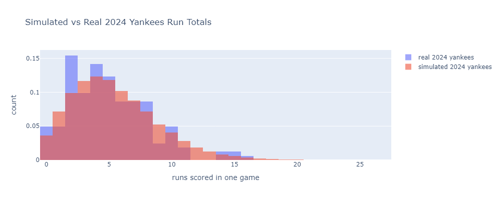
I used 2024 data from Baseball Reference to define the plate appearance outcome probabilities for a lineup of Gleyber Torres, Juan Soto, Aaron Judge, Austin Wells, Giancarlo Stanton, Jazz Chisolm Jr., Anthony Rizzo, Anthony Volpe, and Alex Verdugo.
Alongside the simulation results, I plotted the actual per-game run distribution from the same year. The model lines well with the real data.
Before messing with batting orders, a sanity check. What happens if we remove Aaron Judge from this lineup? He’s the best hitter here by a decent margin, so it should have a big effect. Here’s what the run distribution looks like if you replace Judge with a second copy of leadoff hitter Gleyber Torres.
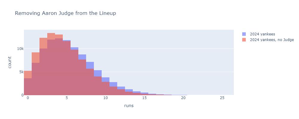
Pretty big effect. Replacing Judge with another Gleyber brings the 2024 Yankees from 5.4 to 4.7 runs per game. Incidentally, if you multiply this per-game difference by the number of games Judge played, subtract the total difference from the Yankees’ 2024 total runs scored, and plug into a Pythagorean win-loss formula, you get a value of about 10 Wins Above Gleyber or 11.7 Wins Above Replacement. This is pretty close to his 2024 fWAR of 11.2. Nice to see different methods agree.
The results
Now let’s get to batting order. Here’s what happens if we do something pretty extreme and slide Judge from 3rd in the lineup, where he typically hit in 2024, all the way down to 9th.
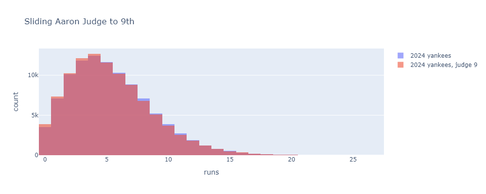
Much smaller change, but actually still significant. This change decreases the average runs scored from about 5.4 to 5.3 runs per game. This pencils out to about one Pythagorean win. One win is significant, but this is a drastic lineup move that no one would ever consider.
Here are the mean runs scored when placing Judge in each lineup position.
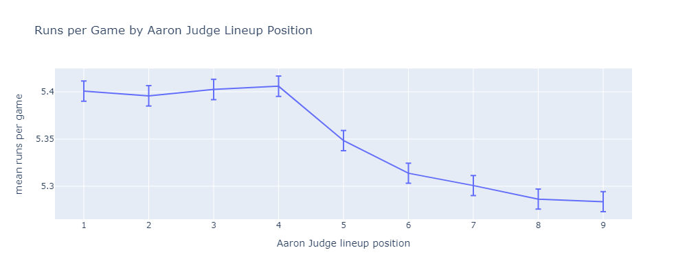
The first four positions are statistically indistinguishable. Once Judge reaches the bottom of the order, there is a real difference. Using this method, it’s easy to dig deeper into why the first four positions are meaningfully better.
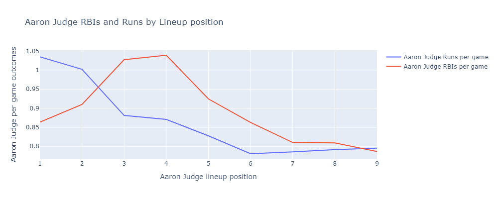
If Judge hits 1st or 2nd, he scores more runs. He hits more often, and gets driven in by Juan Soto a lot. If Judge hits 3rd or 4th, he drives in more runs. He drives in on-base machine Juan Soto a lot.
My conclusion
Overall, I think this means we shouldn’t worry too much about the lineup. Put the best hitters at the top and the worst hitters at the bottom. Don’t hit Aaron Judge ninth.
As I said above, lefty/righty matchups are not factored in here. I think it makes sense to try to alternate lefties and righties in the lineup to avoid giving relief pitchers runs of like-handed hitters to face. I would love to factor this into my model, but the adversarial nature of relief pitcher strategy makes it much more complicated than what I did above.
So alternate lefties and righties, put the best hitters at the top, and stop worrying.
Jake sucks (not really).
Update
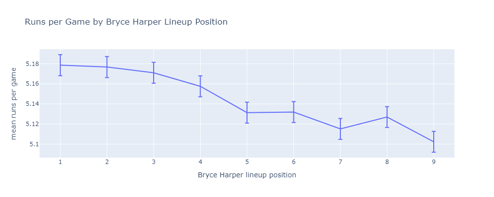
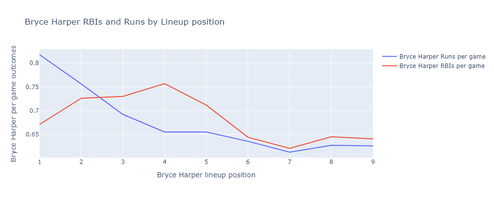
In response to Reddit commenters u/HyperactiveBaldMonk and u/BatJewOfficial, here are similar results for the Bryce Harper and the 2024 Phillies.
*if you ignore a bunch of things including relief pitcher lefty/righty matchup strategy
»Homemade Yagi-Uda Antenna
I’ve been getting into radio again. Phil and I pulled out our old handheld Baofeng radios and tried to reach each other from our houses. He wrote up a post on this too. The radios we have are dual-band, meaning they can transmit and recieve on the 70 cm UHF band and the 2m VHF band. By the way, we both have ARRL Technicians licenses, which are required to transmit in these bands.
We live about a half-mile apart and we found we could hear each other on 70 cm band but not the 2 m. Both of these bands are said to require line of sight. I can’t literally see Phil’s house from mine, but the 70 cm band worked anyway. I guess this means my signal is bouncing around a bit and eventually finding its way to Phil.
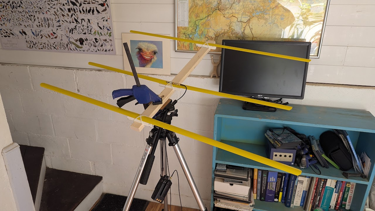
We did this experiment using the stock rubber ducky antenna. These are omnidirectional, so they transmit evenly in all directions within the plane normal to the antenna. If you know where your target is, this is sort of wasteful. You’re spending some of your transmitter’s power in the wrong direction. I thought it would be fun to build a directional antenna for 2 m and see if we could reach each other’s houses. We built a simple antenna design called a Yagi-Uda.
The Yagi-Uda design is probably familiar to you, classic roof-top TV antennas are Yagis.
It consists of a feeder element, which is a pair of conductors that are driven by the radio transmitter, a reflector, and one or more directors.
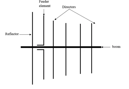 The reflector and directors are just passive conductors but they react to the driven element and contribute to the overall output.
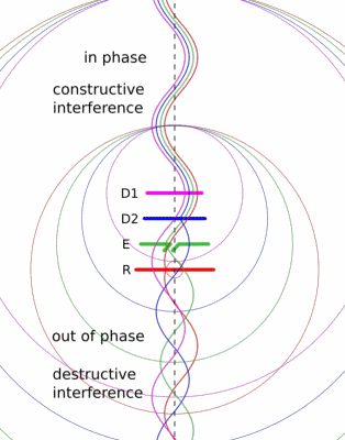
The Wikipedia article has a nice animation that might give you a sense of how the elements work together.
The Build
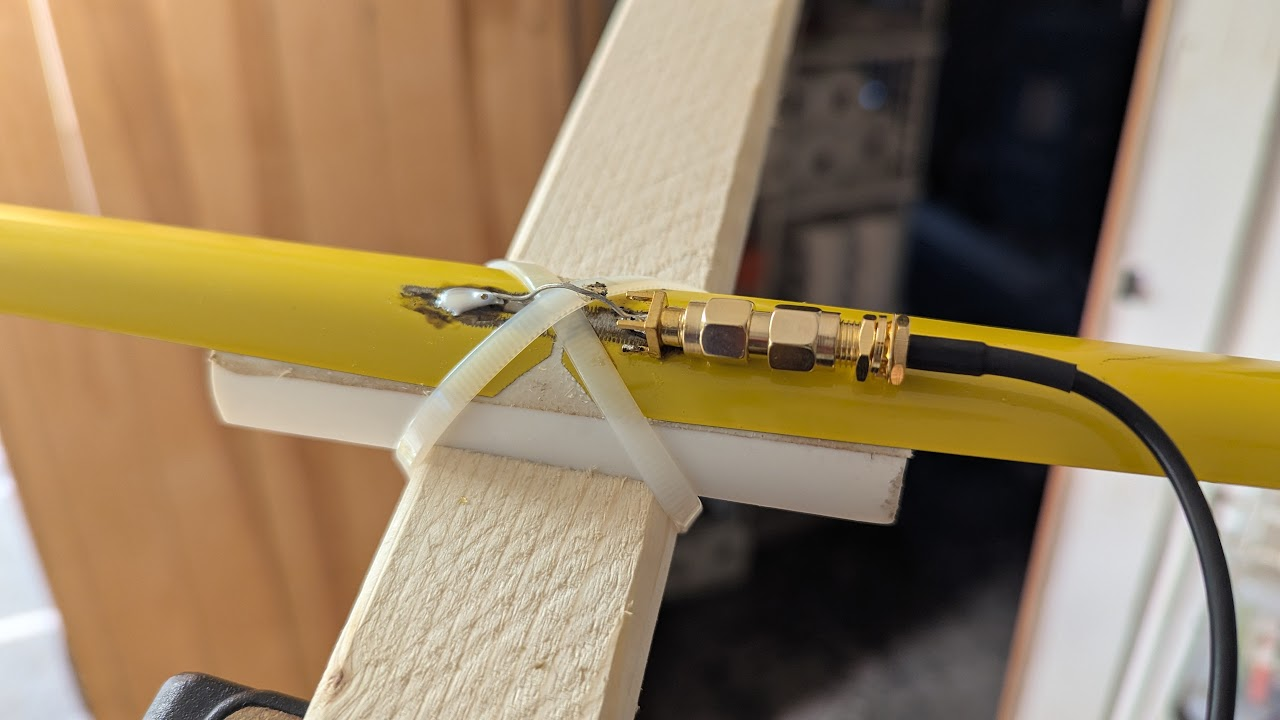
We built a tape measure Yagi. This is a common method for hobbyists and I think it’s really clever. You cut up a tape measure to form the conductors. This has a few benefits. It’s easy to cut. The measurement device is built in. The antenna ends up being flexible and collapsable. You might even have a spare tape measure lying around.
We used the dimensions from an Instructables page which seems to be based on someone else’s design. There are tons of designs out there.
Here’s what we ended up with:
We used pieces of PVC pipe and zip ties to mount the tape measure segements to a wooden boom and soldered an SMA connector across the driven elements.
There are pieces of double sided tape between the tape and the PVC to keep things from sliding.
Tuning
The antenna is designed to work at 145 MHz, which is within the 2 m band. That doesn’t mean that the antenna is ready to use at 145 MHz, however. If the antenna’s impedance doesn’t match the transmitter’s impedance, energy will be reflected back into the transmitter. This could damage the transmitter.
There are different ways of measuring the reflected power, but the most common seems to be Standing Wave Ratio or SWR. SWR is the ratio between the minimum and maximum amplitude of a standing wave in a transmission line. A SWR of 1 means perfect transmission. An SWR of infinity meanse perfect reflection. Online sources suggest that an SWR of less than 2 is a good goal for a radio antenna.
You can buy a standalone SWR meter, but Phil got us a more general instrument called a Vector Network Analyzer or VNA.
Specifically, he got a NanoVNA.
It’s really cool, I highly recommend getting one if you’re into radio at all.
Essentially, it measures the complex impedance of the circuit you connect it to over a range of frequencies.
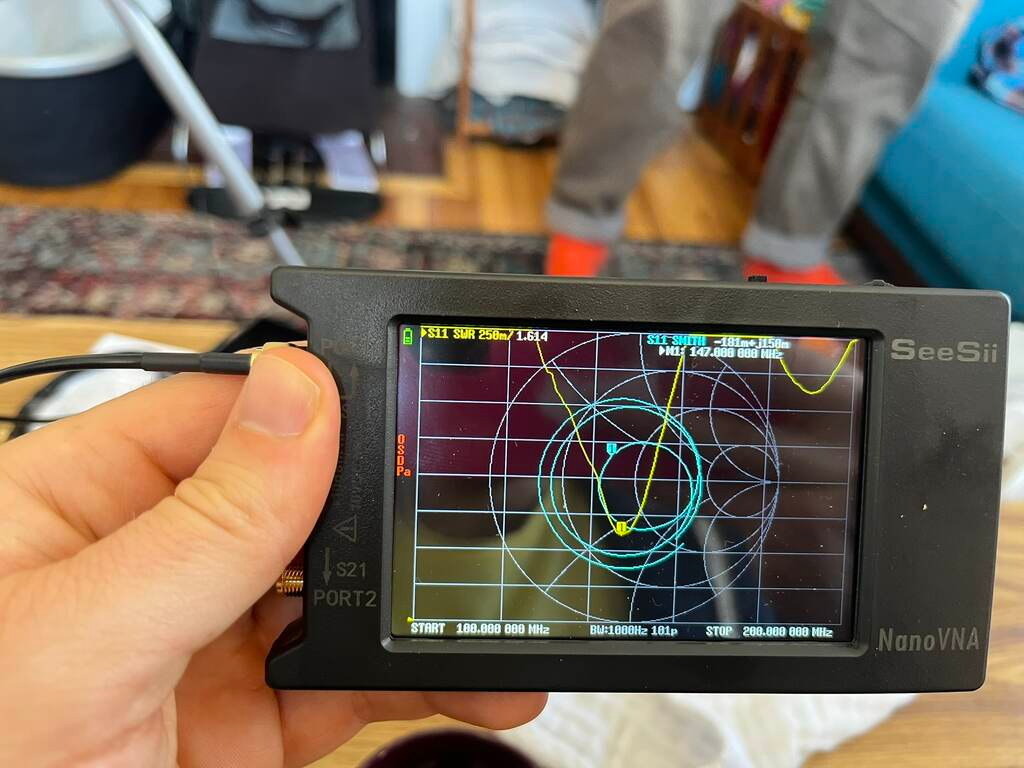 In the image above, the VNA shows two traces.
In yellow is the SWR measured directly.
It shows that at 147 MHz, the SWR is 1.614.
Not bad.
In the image above, the VNA shows two traces.
In yellow is the SWR measured directly.
It shows that at 147 MHz, the SWR is 1.614.
Not bad.
The teal line shows what’s called a Smith chart.
This is a way to plot complex impedance transformed such that a purely resistive 50 Ω load is the center, a short circuit is on the left, an open circuit is on the right, and purely reactive loads are at the top and bottom.
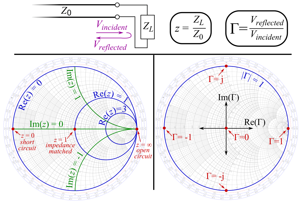
That 50 Ω load is important because that’s the typical output impedance of a radio transmitter. If the antenna’s impedance falls in the center of a Smith chart, the impedances are pefectly matched. In the VNA image above, you can see that the indicated point on the Smith chart trace is close to the center. That means our antenna was well matched to the transmitter. That’s lucky, because we didn’t have a great sense of how we’d tune the impedance if we needed to. These measurements gave us the confidence to plug the antenna into the Baofeng. I turned the transmit power to low just to be safe.
Radiation Pattern
With the antenna built, we decided to try to measure the radiation pattern. That is, measure how much power is emitted at each angle. We mounted the antenna on a tripod and used an RTL-SDR USB radio reciever to measure recieved power.
We rotated the antenna in 10° increments and measured the power at each angle.
Here’s the radiation pattern we found.
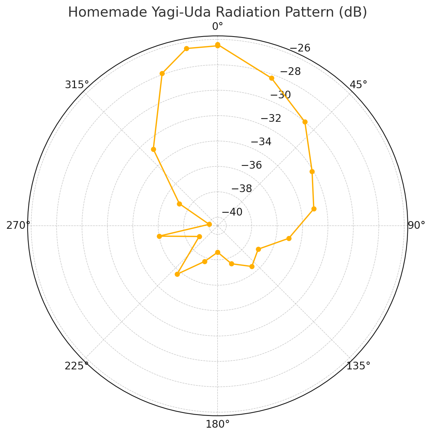
Looks reasonable when compared to other references I’ve seen for Yagi-Uda radiation patterns. One interesteing feature is the asymmetry. We think this may have been caused by my house. In these coordinates, it is located between about 20° and 90°. I believe it reflected a bit of the signal back toward the reciever.
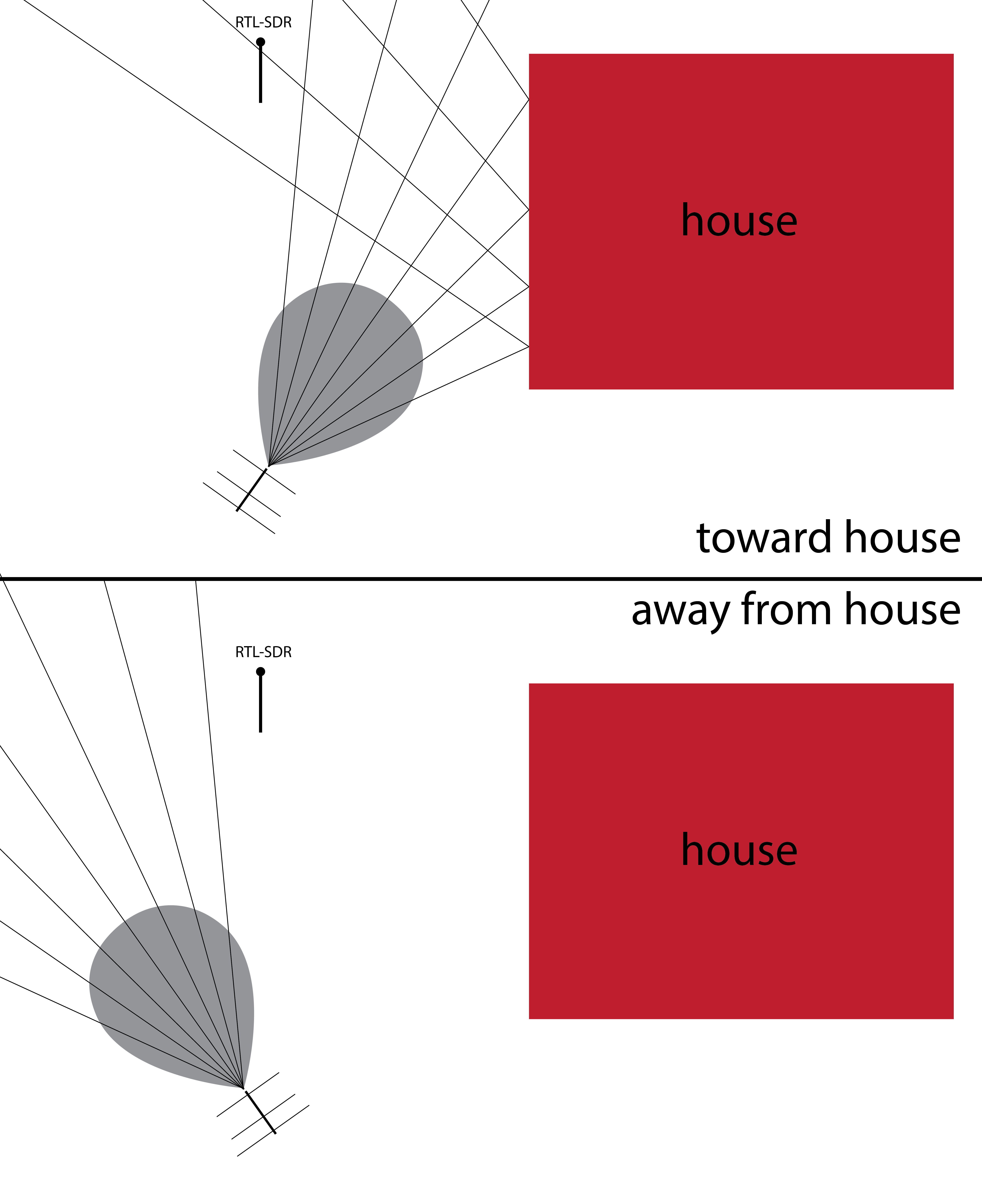
We’ll have to try this out in an empty field.
»Expected Strike Difference -- A simple catcher framing metric
In this post I’ll build a simple catcher framing metric I’m calling Expected Strike Difference. The approach is similar to some other recent posts of mine like this one. Using pybaseball Statcast data I’ll train a classifier to predict whether a pitch will be called a ball or a strike based on the location where it crosses the plate, the count, handedness of the hitter. Then I’ll go through every pitch caught by each catcher and count up the differences between the predicted strikes and called strikes. This difference theoretically represents the number of extra strikes stolen (or lost) compared to an average catcher.
The Data
First the basics.
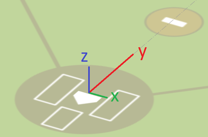
In the Statcast coordinate system, x is inside-outside in the strikezone with the first-base side positive, y is toward-away from the catcher with the field side positive, z is up-down with up positive.
Here’s what the observed strike zone looks like:
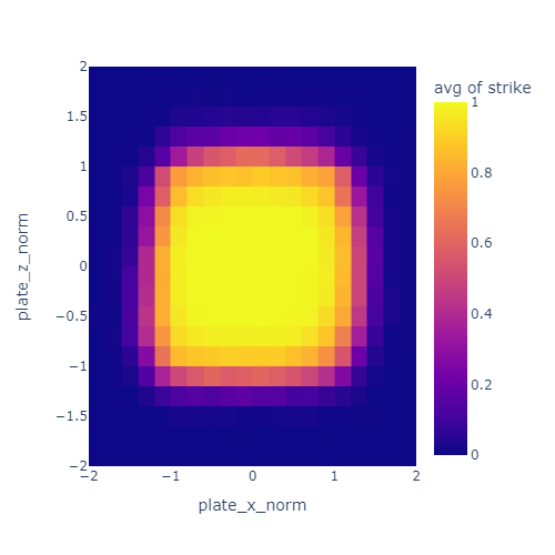
I normalized the pitch location such that the plate spans from -1 to 1 in each dimension. That’s what the “norm” means in the axis labels. The unit here is half plate-widths since -1 to 1 is a full width.
The color represents the probability of a pitch being called a strike based on location. The strikezone is a bit wider than the nominal 17 inches of the plate. Most of this is due to the width of the ball itself (about 3 inches or or 0.17 plate widths).
Next, here a few fun details I found and tried to account for.
Batter handedness
I noticed that the strikezone looks a bit different for left handed and right handed hitters. Specifically, it seems to be offset a little bit away from the hitter. I decided to correct for this by reversing the x direction of the strike zone for lefties.
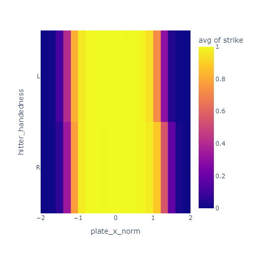
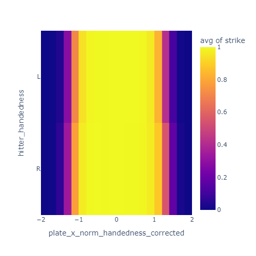
These plots show the just the x coordinate of the strike zone for lefties and righties. In the left plot, the yellow band is offset to the negative-x side for lefties compared to righties. After correcting for handedness by reversing x for lefties, this offset is mostly gone in the right plot.
Two strikes, three balls
I also noticed that umpires are less likely to call a marginal pitch a strike when there are two strikes. I’ve heard this called “omission bias” and it is a well documented effect in strike calling. Basically, umps are a bit adverse to calling strike three or ball four and directly ending the at-bat.
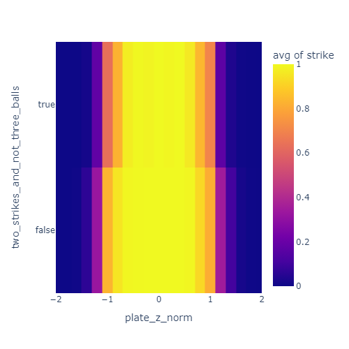
This plot shows a skinnier yellow band when there are two strikes and less than three balls. This indicates that the effective strike zone is smaller in that situation.
Similarly, they are less likely to call a ball with three balls and less than two strikes.
Pitch movement
My intuition was that the transverse velocity (the left-right and up-down velocity) of the pitch will have an influence on the umpire’s call. For example, I expected a pitch at the bottom of the zone to have a better chance of being called a ball if it is breaking sharply downward. I was not able to observe a clear effect like this in the data so I left it out of this model.
The features
Ultimately, the features I used to estimate strike probability were:
- Normalized and handedness-corrected x position when crossing the plate
- Runs from -1.0 on the outside edge of the zone to 1.0 on the inside edge
- Normalized z position when crossing the plate
- Runs from -1.0 on the low edge of the zone to 1.0 on the high edge
- Whether there are two strikes and less than three balls
- Set to 1.0 if there are two strikes and less than three balls, 0.0 otherwise
- Whether there are tree balls and less than two strikes
- Set to 1.0 if there are three balls and less than two strikes, 0.0 otherwise
Here’s what the data processing code looks like if you’re curious. It uses PyBaseball and Polars.
PLATE_WIDTH_IN = 17
PLATE_HALF_WIDTH_FT = PLATE_WIDTH_IN / 2 / 24
balls_strikes = (
    pl.from_pandas(statcast(start_dt="2023-04-01", end_dt= "2024-04-01"))
    .filter(
        pl.col('description').is_in(['called_strike', 'ball'])
    )
    .select(
        pl.col("fielder_2").alias("catcher_id"),
        (pl.col("description") == "called_strike").cast(int).alias("strike"),
        "plate_x", # x location at plate in feet from center
        "plate_z", # z location at plate in feet from ground
        "sz_bot", # bottom of strike zone for batter in feet from ground
        "sz_top", # top of strike zone for batter in feet from ground
        (pl.col("sz_top") - pl.col("sz_bot")).alias("sz_height"),
        (pl.col("strikes") == 2).alias("two_strikes"),
        (pl.col("balls") == 3).alias("three_balls"),
        (1 - (2 * (pl.col("stand") == "L"))).alias("handedness_factor"), # -1 for lefties, 1 for righties
    )
    .with_columns(
        ((pl.col("plate_z") - pl.col("sz_bot")) / pl.col("sz_height") * 2 - 1).alias("plate_z_norm"), # plate_z from -1 to 1
        (pl.col("plate_x") / PLATE_HALF_WIDTH_FT).alias("plate_x_norm"), # plate_x from -1 to 1
        (pl.col("two_strikes") & ~pl.col("three_balls")).alias("two_strikes_and_not_three_balls"),
        (~pl.col("two_strikes") & pl.col("three_balls")).alias("three_balls_and_not_two_strikes"),
    )
    .drop_nulls()
)
K Nearest Neighbors
I used a method called K Nearest Neighbors(KNN) to establish the expected strike probability for each pitch. For each pitch, I look up the 25 most similar pitches. The set of similar pitches is called the “neighborhood” and (in this case) it’s determined based on distance when plotted on a graph. For example, the neighborhood might look like this for a pitch near the inside corner for a right handed hitter.
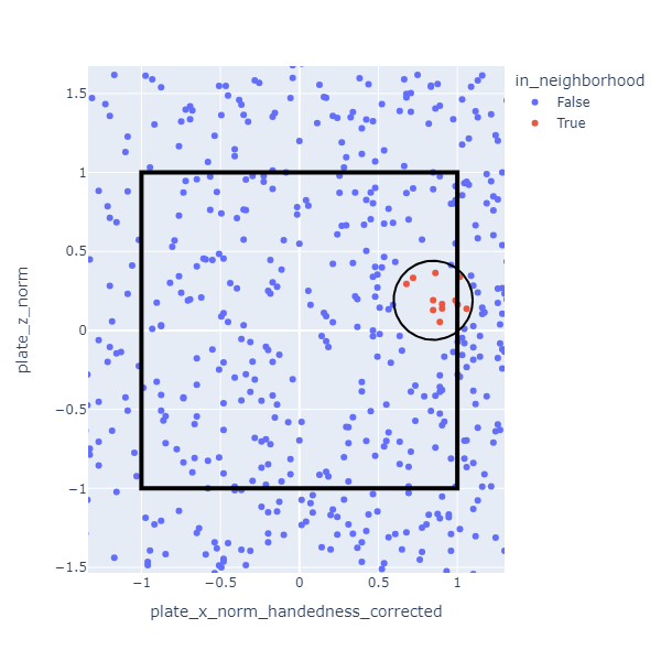
The expected strike probability is defined as the the fraction of pitches in the neighborhood that were called strikes. In the data I used, the neighborhoods are much smaller than the one depicted. There are so many pitches that the 25 nearest ones are close together.
Two of the features I used (two strikes less than three balls, three balls less than two strikes) have values that are either 0 or 1. These have an interesting effect on the neighborhood calculation. Because of the relative scales involved, neighborhoods will almost always include only pitches with the same value for these discrete features. This is okay though.
Essentially I have three separate classifiers here: one for 0-2, 1-2, and 2-2 counts when umpires are more inclined to call a ball, one for 3-0 and 3-1 counts when umpires are more likely to call a strike, and one for all other counts.

Results
With this KNN method it’s easy to evaluate a catcher. For each catcher, look at the pitches they received. For each pitch find the neighborhood pitches and calculate the fraction that were called strikes. Add up these fractions to determine the number of expected strikes. Compare that sum to the total number of strike calls they got.
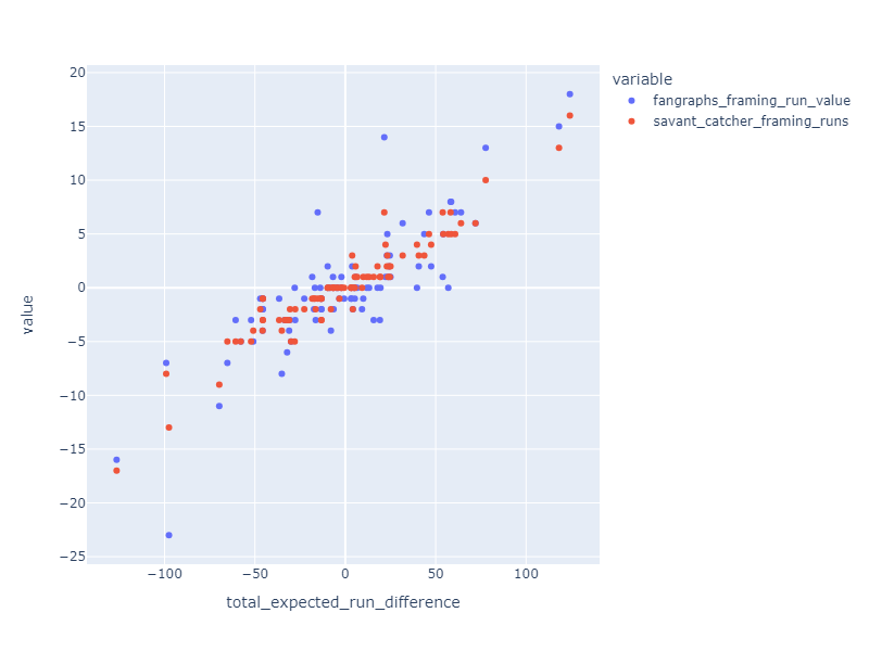
The resulting stat correlates well with Fangraphs and Baseball Savant catcher framing statistics.
Finally, here’s how the numbers come out for 2023:
| Name | Avg expected strike difference (per 100 pitches) |
Total expected strike difference |
|---|---|---|
| Francisco Álvarez | 1.52 | 125.72 |
| Patrick Bailey | 1.94 | 124.24 |
| Austin Hedges | 2.33 | 118.20 |
| Jonah Heim | 0.83 | 77.64 |
| Jose Trevino | 1.87 | 72.00 |
| Víctor Caratini | 1.61 | 68.20 |
| Cal Raleigh | 0.77 | 64.00 |
| Jake Rogers | 0.87 | 60.76 |
| Alejandro Kirk | 0.83 | 58.56 |
| William Contreras | 0.70 | 58.24 |
| Adley Rutschman | 0.70 | 56.96 |
| Seby Zavala | 1.22 | 54.20 |
| Kyle Higashioka | 0.99 | 53.88 |
| Jason Delay | 1.11 | 47.48 |
| Cam Gallagher | 1.36 | 46.28 |
| Christian Vázquez | 0.69 | 43.68 |
| Tucker Barnhart | 1.54 | 40.64 |
| Yasmani Grandal | 0.66 | 39.64 |
| Austin Wynns | 0.95 | 31.72 |
| Joey Bart | 1.25 | 25.00 |
| Freddy Fermin | 0.58 | 24.64 |
| Miguel Amaya | 0.97 | 24.28 |
| Ben Rortvedt | 1.15 | 23.64 |
| Nick Fortes | 0.34 | 23.24 |
| Gary Sánchez | 0.50 | 23.00 |
| Travis D'arnaud | 0.47 | 22.24 |
| Sean Murphy | 0.30 | 21.56 |
| Brian Serven | 2.54 | 19.44 |
| Blake Sabol | 0.59 | 19.16 |
| René Pinto | 0.73 | 17.80 |
| Austin Barnes | 0.43 | 15.68 |
| Tomás Nido | 0.93 | 13.16 |
| Tyler Heineman | 1.18 | 11.92 |
| Mike Zunino | 0.38 | 9.92 |
| Ali Sánchez | 6.04 | 9.48 |
| Austin Wells | 0.51 | 9.24 |
| Reese Mcguire | 0.17 | 6.56 |
| Danny Jansen | 0.12 | 5.68 |
| Roberto Pérez | 2.07 | 5.28 |
| Omar Narváez | 0.16 | 5.24 |
| Alex Jackson | 2.65 | 5.04 |
| Dillon Dingler | 3.70 | 4.88 |
| Logan Porter | 0.71 | 4.84 |
| Will Smith | 0.05 | 4.16 |
| Bo Naylor | 0.08 | 3.80 |
| Sandy León | 0.42 | 3.32 |
| Anthony Bemboom | 0.76 | 3.28 |
| Mj Melendez | 0.55 | 3.20 |
| Caleb Hamilton | 2.08 | 3.00 |
| Andrew Knapp | 8.67 | 2.60 |
| Grant Koch | 3.45 | 2.52 |
| Payton Henry | 1.72 | 2.20 |
| Israel Pineda | 8.17 | 1.88 |
| Carlos Narvaez | 7.27 | 1.60 |
| Tres Barrera | 2.47 | 1.48 |
| Henry Davis | 0.09 | 0.48 |
| Austin Allen | 4.36 | 0.48 |
| Chris Okey | 0.69 | 0.40 |
| Zack Collins | 0.28 | 0.36 |
| Rob Brantly | 1.27 | 0.28 |
| Mickey Gasper | 1.41 | 0.24 |
| Dom Nuñez | 2.67 | 0.16 |
| David Bañuelos | -0.00 | -0.00 |
| Hunter Goodman | -0.52 | -0.12 |
| Joe Hudson | -0.61 | -0.20 |
| Chuckie Robinson | -0.93 | -0.28 |
| Mark Kolozsvary | -0.34 | -0.48 |
| Aramis Garcia | -0.60 | -0.52 |
| Jorge Alfaro | -0.16 | -0.64 |
| Tyler Cropley | -0.47 | -0.88 |
| Pedro Pagés | -1.40 | -1.12 |
| Manny Piña | -1.06 | -1.32 |
| Jhonny Pereda | -9.20 | -1.84 |
| César Salazar | -0.46 | -2.16 |
| Mitch Garver | -0.12 | -2.20 |
| Kyle Mccann | -1.28 | -2.36 |
| Drew Romo | -10.21 | -2.96 |
| Korey Lee | -0.17 | -3.28 |
| James Mccann | -0.10 | -4.08 |
| Brian O'keefe | -1.11 | -4.84 |
| Michael Pérez | -3.89 | -5.64 |
| Chad Wallach | -0.19 | -6.48 |
| Drew Millas | -0.94 | -6.68 |
| Chadwick Tromp | -1.52 | -6.80 |
| Eric Haase | -0.20 | -7.96 |
| Luis Torrens | -5.09 | -8.24 |
| Meibrys Viloria | -4.40 | -8.44 |
| Iván Herrera | -0.77 | -8.52 |
| Sam Huff | -3.14 | -9.68 |
| Endy Rodríguez | -0.28 | -9.76 |
| Carlos Pérez | -1.34 | -13.24 |
| Curt Casali | -0.66 | -13.88 |
| Gabriel Moreno | -0.18 | -15.28 |
| Luis Campusano | -0.50 | -16.40 |
| Matt Thaiss | -0.33 | -16.84 |
| Tyler Soderstrom | -1.57 | -17.32 |
| Carson Kelly | -0.51 | -18.32 |
| Christian Bethancourt | -0.34 | -22.68 |
| Brett Sullivan | -1.48 | -27.72 |
| Yainer Diaz | -0.70 | -28.00 |
| Jacob Stallings | -0.56 | -30.04 |
| David Fry | -3.01 | -30.60 |
| Austin Nola | -1.00 | -31.08 |
| Tom Murphy | -1.17 | -32.20 |
| Garrett Stubbs | -1.31 | -33.56 |
| Ryan Jeffers | -0.63 | -35.12 |
| Salvador Pérez | -0.55 | -35.52 |
| Yan Gomes | -0.52 | -36.60 |
| José Herrera | -1.35 | -38.56 |
| Carlos Pérez | -1.82 | -45.64 |
| Francisco Mejía | -1.47 | -45.76 |
| Luke Maile | -1.05 | -47.04 |
| Andrew Knizner | -1.01 | -50.92 |
| Willson Contreras | -0.75 | -52.12 |
| Riley Adams | -1.84 | -57.80 |
| Connor Wong | -0.75 | -60.68 |
| Logan O'hoppe | -1.57 | -65.24 |
| Tyler Stephenson | -1.13 | -69.72 |
| Elías Díaz | -1.07 | -96.52 |
| Keibert Ruiz | -1.06 | -97.56 |
| Shea Langeliers | -1.03 | -99.08 |
| Martín Maldonado | -1.41 | -126.52 |
| J. T. Realmuto | -1.18 | -126.96 |
White Mountains 4000 Footers
I’m trying to summit all of the 4000 foot peaks in the White Mountains. Here’s how far I’ve gotten:
»Expected Outs Difference -- A simple team fielding metric
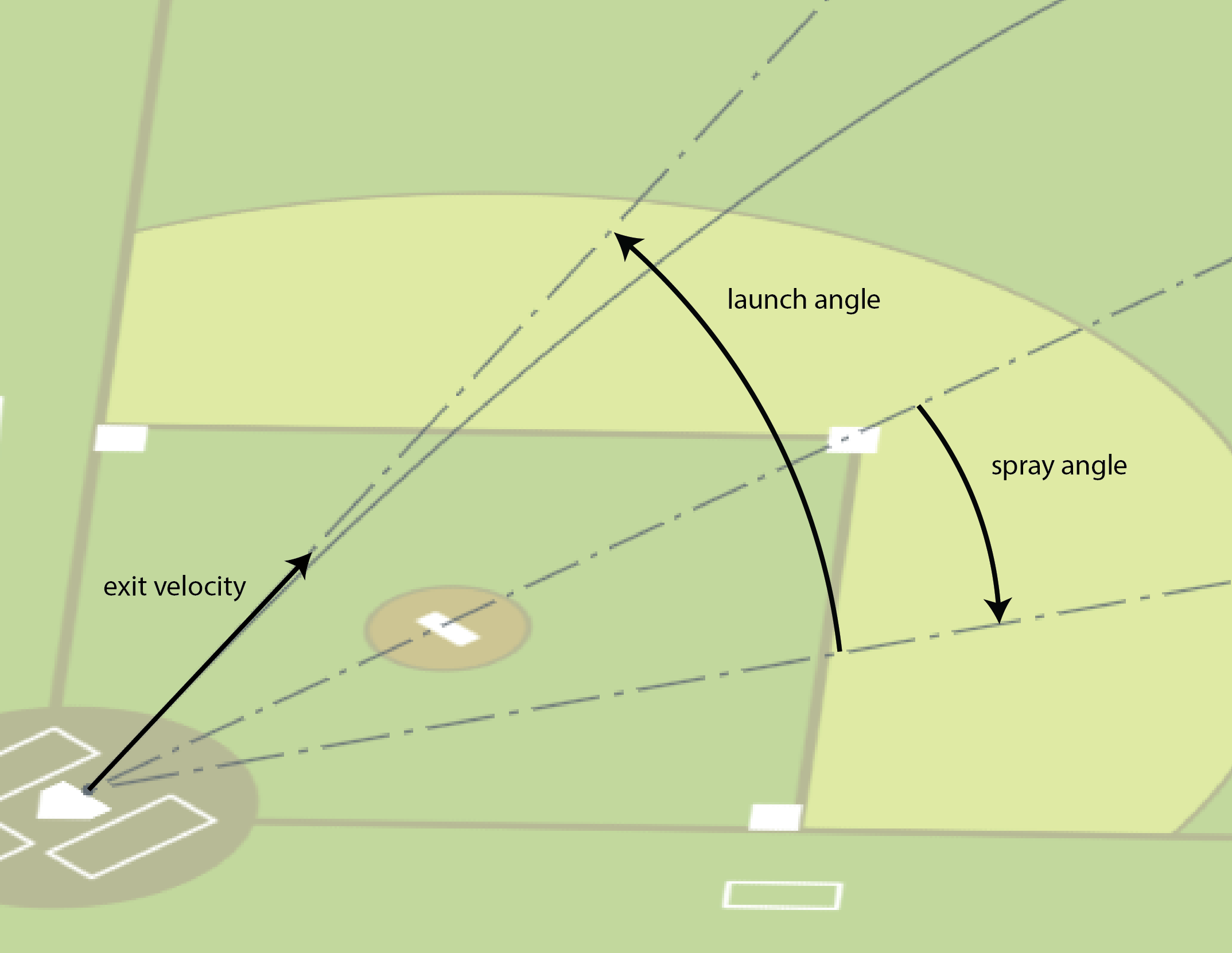
In this post, I’m going to outline a simple baseball team fielding metric I thought of. I’m calling it Expected Outs Difference or EOD.
Here’s the plan:
- Obtain a data set of balls put in play
- Train a supervised model to predict whether a given ball will become and out based on exit velocity, launch angle, and spray angle
- Evaluate a team’s defense by running the model against each ball they faced and comparing the predicted outs with the actual ones
This method allows me to compare how well a team’s defense does at compared to what we’d expect based on how other teams do.
The data
I started by downloading a 2023 Statcast dataset using pybaseball. This gave me a table containing every pitch from the season.
from pybaseball import statcast
from pybaseball.datahelpers.statcast_utils import add_spray_angle

OUTS_EVENTS = ["field_out", "fielders_choice_out", "force_out", "grounded_into_double_play", "sac_fly_double_play", "triple_play", "double_play"]
START_DATE = "2023-03-01"
END_DATE = "2023-10-01"

data = add_spray_anglestatcast(start_dt=START_DATE, end_dt=END_DATE))

# filter out strikes and balls
balls_in_play = data[data["type"] == "X"]

# filter out foul outs
balls_in_play = balls_in_play[balls_in_play["spray_angle"].between(-45, 45)]

# label outs
balls_in_play["out"] = balls_in_play["events"].isin(OUTS_EVENTS)

# drop rows with missing data
balls_in_play = balls_in_play.dropna(subset=["launch_angle", "launch_speed", "spray_angle"])
Statcast provides a lot of information, but what I most cared about was exit velocity, launch angle, spray angle, and play outcome.
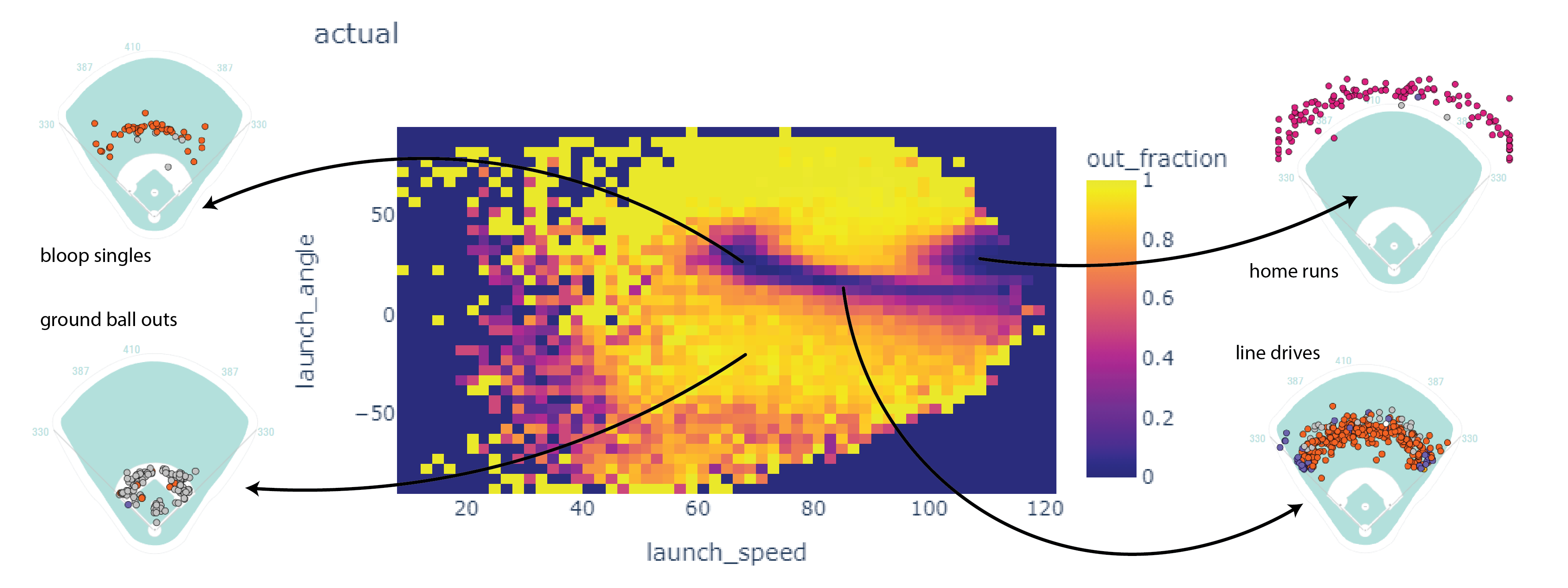
Here’s a 2D histogram showing the fraction of the hits within bins in exit velocity and launch angle that became outs.
Balls in the dark areas usually fall for hits.
Balls in the yellow areas are usually outs.
The model
I trained an SKLearn KNeighbors classifier. To make a prediction, this model looks up the eight most similar hits. If most of those hits became outs, the model classifies it as an out. If not, the model classifies it as a non-out.
from sklearn.neighbors import KNeighborsClassifier

X = balls_in_play[["launch_speed", "launch_angle", "spray_angle"]]
y = balls_in_play["out"]
clf = KNeighborsClassifier(n_neighbors=8).fit(X, y)

balls_in_play["predicted_out"] = clf.predict(X)
This isn’t perfect. When the model is classifying a point, it will always find the point itself as one of the nearest neighbors. I don’t think this is a big issue though.
Calculating EOD
Finally, I used the model to evaluate Expected Outs Difference.
# create a column giving the id of the fielding team
balls_in_play["fielding_team"] = np.where(balls_in_play["inning_topbot"] == "Top", balls_in_play["home_team"], balls_in_play["away_team"])

# group by fielding team and sum outs and predicted outs
teams = balls_in_play.groupby("fielding_team").agg({"out": "sum", "predicted_out": "sum", "events": "count"})

# subtracting the expected outs from the predicted outs gives Expected Outs Difference
teams["out_diff"] = teams["out"] - teams["predicted_out"]
teams.sort_values("out_diff", ascending=False)
              out	   predicted_out    events      out_diff
fielding_team
MIL           2634          2561          3947          73
CHC           2622          2578          4057          44
BAL           2719          2679          4183          40
AZ            2787          2754          4309          33
TEX           2658          2626          4072          32
TOR           2702          2672          4204          30
SEA           2609          2580          3989          29
LAD           2729          2704          4144          25
CLE           2751          2730          4231          21
ATL           2581          2566          4035          15
KC            2688          2677          4272          11
SD            2565          2558          3919          7
DET           2783          2781          4310          2
CWS           2541          2539          4002          2
PIT           2766          2764          4350          2
MIN           2673          2677          4121          -4
NYM           2610          2619          4088          -9
NYY           2771          2780          4237          -9
TB            2719          2735          4146          -16
SF            2661          2681          4178          -20
WSH           2731          2754          4367          -23
MIA           2645          2669          4139          -24
HOU           2623          2649          4061          -26
OAK           2635          2667          4234          -32
STL           2922          2962          4660          -40
PHI           2772          2821          4301          -49
LAA           2620          2685          4153          -65
BOS           2633          2698          4179          -65
CIN           2636          2717          4179          -81
COL           2864          2957          4662          -93
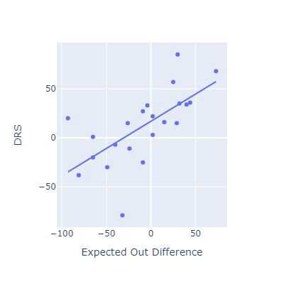
Evaluating EOD against other fielding metrics
This approach seems to roughly match other popular fielding metrics.
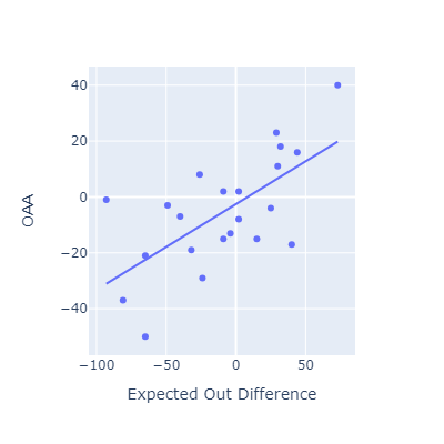
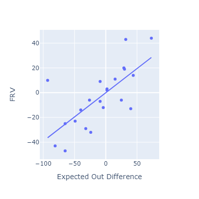
I think my method here is most conceptually similar to OAA. Oddly, that’s the metric that EOD correlates most poorly with.
»